The Hidden Language of Acetate
There is a moment I have witnessed thousands of times on the shop floor and at trade shows. Someone picks up a frame, turns it over once, flexes the temple slightly, and says: “You can just feel the quality, can’t you?”
They are not wrong. But most of them could not tell you exactly what they are feeling, or why.
What they are responding to, often without knowing it, is acetate. Acetate, more than any other material in eyewear, speaks a language that goes far deeper than aesthetics.
What Acetate Actually Is
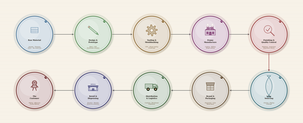
Cellulose acetate is a plant-based plastic, derived primarily from cotton fibres or wood pulp. It has been used in eyewear since the early twentieth century, long before the era of cheap injection-moulded alternatives. It arrives in eyewear factories as a sheet. Layered, compressed and polished. It is from these sheets that frames are cut, shaped, and finished by hand.
That process matters. It is slow, it is skilled, and it is expensive. Which is precisely why some brands do it, and why others don’t.
The Grammar of Touch
Often before a customer reads a brand name, before they clock a price tag, they touch. The tactile language of acetate communicates instantly.
Genuine acetate has warmth. It absorbs body heat quickly and reflects it back. Hold a well-made acetate frame in your palm for ten seconds and it begins to feel like an extension of you. Injection-moulded plastic: TR90, nylon, polycarbonate, stays cool, stays separate.
Acetate also has weight, but not in a blunt way. The density is even. It does not feel heavy; it feels substantial. There is a difference, and customers feel it even when they cannot name it.
All of this happens before a word is spoken. The material has already made the frame’s first impression.
Colour as Communication
One of the most under-discussed advantages of acetate is what it does with colour.
Acetate is not painted. It is not coated. The colour is structural, embedded in the layers of the material itself. This means it does not fade the same way surface-finished alternatives do. But more importantly for brand identity, it means colour has depth.
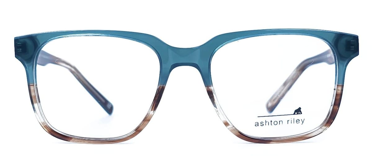
Look at a well-executed tortoiseshell pattern in quality acetate. The amber bleeds into the brown, which bleeds into the honey. The layers catch light differently depending on angle. It is alive in a way that a flat sprayed colour can never be.
This is why heritage brands, those who have been building identity for decades, almost never abandon acetate for their core collections. The material is part of the brand language. To swap it out for a cheaper alternative is not a cost-saving decision; it is a communication decision. It tells the customer something has changed. And customers notice, even when they cannot articulate what.
The Designer’s Argument
From a design perspective, acetate is simply the more honest material.
It shows craftsmanship. The way a pattern is positioned on a frame front, centred, balanced, or deliberately asymmetric, is a creative decision that requires skilled hands at the cutting stage.
It ages. Unlike many alternatives, acetate develops over time. A frame worn daily for three years tells a story. It softens slightly, takes on the character of its wearer. For brands built on the idea of personal expression, this is not a flaw. It is a feature.
And it finishes beautifully. The tumbling and polishing process that gives a quality acetate frame its final surface is manual. That lustre, that depth of shine that stops people mid-reach in a display cabinet, cannot be replicated with a quick buff on an injection-moulded piece.
The Case Against (and Why It Does Not Hold)
The objections to acetate are real, and worth acknowledging.
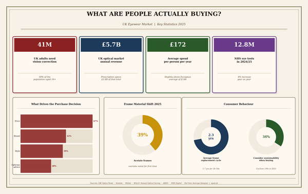
It is heavier than some alternatives. For certain wearers and certain prescription weights, this matters. It is more expensive to produce. For brands operating at volume and lower price points, the maths simply do not work. And it requires more careful handling. Acetate frames need proper adjustment from a skilled optician.
But here is the thing: every one of those objections describes a trade-off, not a defeat.
Heavier means substantial. Expensive means considered. Requiring skilled adjustment means the optician matters. For brands that want to occupy the premium or independent space, these are not problems to overcome. They are positioning tools.
The brands that have moved away from acetate to cut costs have often found themselves caught in a difficult middle ground. No longer able to command premium pricing, but not cheap enough to compete on volume. The material was doing more work for them than they realised.
What It Signals in the Market
Walk any trade show floor. Mido, Silmo, 100% Optical and you will still see many of the most talked-about collections leaning heavily into acetate. New colourways. Unexpected layering. Marble effects, botanical inclusions, gradients that shift over the course of the frame.
The material is not standing still. Suppliers are innovating constantly. Bio-acetate options with improved sustainability credentials, new finishing techniques, unexpected combinations with new metals and wood.
Yet the fundamentals remain unchanged. Acetate communicates craft. It communicates intention. It communicates a brand that has thought carefully about what it is putting into the world.
The Bottom Line
In an industry increasingly pressured by fast fashion thinking: more SKUs, lower prices, faster turnaround. Acetate is a quiet act of resistance.
It is a material that says: we are not in a hurry. That says: this took skill. That says, we believe the person wearing this deserves something that will last.
For independent brands and designers operating in the premium space, that message is not just about aesthetics. It is the brand itself, expressed in a material that customers hold in their hands and immediately understand. Even if they would never be able to explain exactly why.